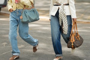
Color is an essential element in establishing the emotional tone of the season and influencing the overall mood.
That was the message behind Future Snoops’ (formerly Fashion Snoops) color forecast for Spring/Summer 2027. In a recent webinar, Hallie Spradlin, Future Snoops director of visionary, described three color shifts for the upcoming season, naming the key anchor colors and the cultural drivers behind their importance.
In developing the forecast, she said it became very apparent that the Future Snoops team were all deeply craving the return of rich, meaningful and enlivened color.
Related Stories
Here’s a closer look at the color forecast.
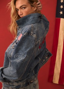
Bygone Era
Bygone Era is a color shift that reflects the thrill of discovering unique vintage finds. Describing “treasures trapped in a specific era,” Spradlin said the imperfect and unfiltered colors are inspired by hues that are rare to find in current fashion.
“This shift evokes colors that have faded from modern memory. They carry the residue of time, softened, warped and altered by age,” she said. “There’s a beauty in their imperfection, a longing for something lost but rediscovered, like the worn edges of a cherished garment or the faded allure of an old film. These colors feel both familiar and slightly off. They’re unsettling yet magnetic.”
The trick is to embrace combinations that were formerly considered clashing or bad taste. Spradlin said the colors “thrive on unexpected friction, deliberately out of sync, challenging the eye to recalibrate.” By “defying traditional harmony,” the colors invite new opportunities to express personal style.
External factors driving this color story include a new narrative around sustainability that reframes it as an opportunity for growth and empowerment, and the popularity of niche interests. Additionally, younger generations are adapting to mobile and flexible living home ownership remains out of reach for many. This requires dwellers to surround themselves with items that feel like home.

Pickled Green, which Spradlin said possesses a clarifying quality that bridges the gap between classic olives and lush greens, is the anchor color. Over the past three seasons, she said the regenerative nature of the hue has become even more grounded, morphing from a crisp apple color to this lusher and nature derived hue.
Polarizing Purple (a softened royal purple), Yam Pink (a color that sits between pink and purple) and Cardboard (a butterscotch beige) evoke time worn qualities across a range of materials like malleable plant leathers, sun worn suede and lightweight silks and chiffons. Meanwhile, Yucky Yellow provides an offbeat yellow that is both a statement and grounding.
“To embrace the vintage inspired charm, consider deadstock trims, details and materials for a unique expression to create these one of a kind, pieces that are suitable for any era,” Spradlin said.
Sun Glazed
Described as a “seductive fusion of past, present and future, where nature’s rich earth and hues are drizzled with an otherworldly sheen, balancing futurism with an inherent sense of warmth, Sun Glaze is a color store that captures the essence of summer dusk.
In Sun Glaze, colors feel both sun-drenched and weathered by time. Their depth is intensified by unexpected glints and metallic finishes. They have a natural brilliance and favor a new offering of neutrals for the season. Think of it as that “fleeting golden hour where the world is bathed in a fire lit glow, casting elongated shadows and igniting surfaces with an almost hypnotic radiance,” Spradlin added.
Cultural signals behind the color trend are the continuing desire to disconnect from digital noise and reconnect with the physical world, and “lore core,” the desire for deeper storytelling and emotional connection. There’s also a shift in how people gather information. Spradlin said people are increasingly seeking firsthand experiential knowledge over abstract data. “With the rise of alternative education, apprenticeships and real-world expertise, brands and institutions must embrace tactile, immersive learning to stay relevant in a landscape where credibility is earned through lived experience,” she said.
The story’s anchor color, Sun Kiss, is an orange tinted red that embodies fiery, solar heat. While the color cements red as a driving color season after season, Spradlin said the hue subtly shifts toward more burnt and darken coral shades. “It’s bold, seductive and just a little bit dangerous,” she said.
Subtly tinted colors Rose Quartz and Purple Dusk, “sensual and smoldering” Black Jam, Golden Hour (a lively copper brown) and Amber Ash (a deep coral) round out the palette. Spradlin called out Rose Quartz as an example that signifies the importance of subdued earthen colors and how pink hues are leaning toward neutrals.
Surface application is how these colors come to life, Spradlin said, naming luster satin, intricate jacquard, silky nylons and supple leathers as standouts.
Nourishment
In Nourishment, color radiates energy. “It’s an antidote to uncertainty, a surge of mood lifting dopamine [and] charged optimism. It’s a reminder of colors’ raw power to energize, reassure and inspire awe,” Spradlin said.
“These are colors that pulse with warmth, drawn from places where vibrancy is woven into the fabric of daily existence. Here, color isn’t an accent. It’s entwined in the culture, entwined in nature, within rhythm. It’s the glow of tropical petals, the electric buzz of markets brimming with ripe and sun drench fruit, or the sky burning molten gold before dissolving into neon pink,” she described.
Key drivers of the trend include the desire to rebuild communities without compromising self-expression, a growing sense of curiosity and exploration and using AI to enliven and delight. “By harnessing the power of generative AI’s unpredictability, brands can spark surprise by offering experiences that reawaken discovery and joy in a world that’s growing desensitized to novelty,” she said.
Aqua Rush, a bright and bold hue, is the anchor color. It offers both natural beauty and a sense of escapism. Spradlin said it is a “culturally inclusive hue that bridges personal expression with a sense of belonging, celebrating diversity through color” and added that it is “brilliantly bold” and “pushes the boundaries of joy.”
The chromatic color palette is heavy on juicy citrus tones. They include Plump Papaya, Ruby Grapefruit (ruby red with an orange undertone) and Burst Berry as well as Overripe Banana (with a mustard undertone) and Glowing Green, a yellow-tinted energetic hue. Spradlin said the colors glow on surfaces like hand-dyed silks, satin jerseys and waxed canvas.